Hero Notes
Notes on designing the hero section of a website or landing page.
Components
The basic components are:
- an image
- a headline
- subtext - this could be a single point or several points separated into blocks
- CTA usually in the form of a button
Optional:
- Social proof: something that imparts some trust, testamonials, reviews, press quotes, brands that use, stats etc..
While a menu is often part of the page too it’s not a necessary part and is sometimes left out to avoid leakage thus preventing a user going elsewhere.
The 3 things a good hero should do
- Answer the question: what do you do?
- Answer: how will it benefit the vistor
- Click to Action or CTA - what does the visitor do next?
Another version is:
- What is this?
- What do you do?
- What’s in it for me?
The hero image
There are lots of options for the hero image. It can be full screen or just take up part of the page. The type of image can be literally anything including a video or animation.
Examples include:
- colour photo
- black & white photo
- collage
- AI generated image
- a drawing
- a painting
- vector art
- vector/css animation
- video
- CSS art such as a gradient
- typography based
- diagram or chart based
The type of image can connect emotionally with the viewer. Choosing carefully will set mood or tone of the page. It could be purely a mood thing or more informative or even a straight product image.
On a web page
How a hero section fits into the rest of the page. (Image from Just In Mind)
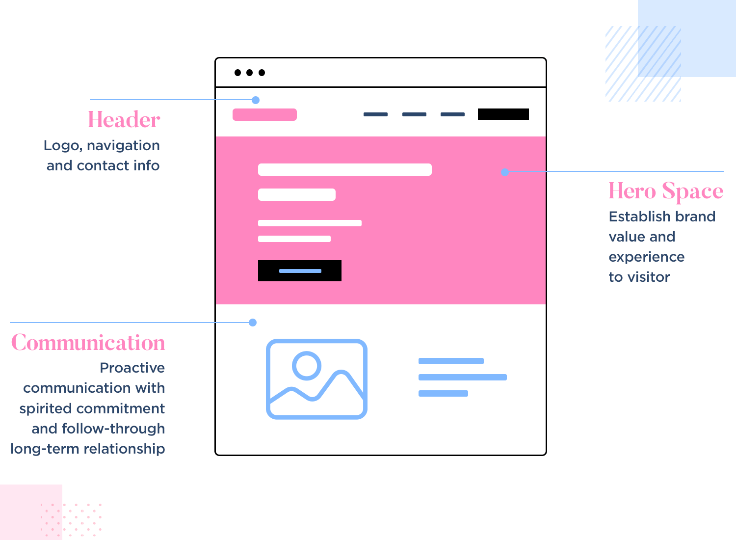
Just In Mind say:
A hero image is a large or oversized web banner image that is pinned to the header section of a webpage, usually towards the top of the page. Because of its prominent place in the site’s visual hierarchy, the hero header is often the first thing users see when arriving on a website. Over the years, it’s become one of the most widely used and beloved UI patterns out there.
White space
Using white space to separate the different components helps draw attention to those components and makes a design more professional looking.
Those elements typically comprise:
- main menu
- image (background or otherwise)
- Title or large text saying what this is (above)
- subtext explaining the benefits to the viewer
- CTA link (use a button to draw attention)
Even the first item, the menu, deserves careful use of white space, both around it and in between each item. The menu could be broken into subsection with more space between. Some links may require just an icon such as a magnifying glass for a search link or a house for a home link.
More..
Information, inspiration and layout ideas can be found at:
- Step by Step guide to landing pages that convert great article by Harry Dry.
- How to write a landing page title another good read by Harry Dry
- 61 Genius Call to Actions
- CTA Buttons a post on canva.com.
- lapa.ninja
- Landing Folio
- Landing Folio’s hero sections. See also their CTA’s
- Dribbble
- What Is A Lead Generating Sales Funnel? gives an overview of making a sale, thus a wider perspective of where the website part fits in.